Gold gets all the press for being a hedge against crazed government spending and paper money debacles… but this week's chart displays another.
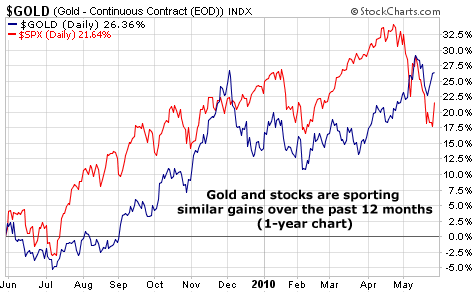
Our chart of the week is a "performance chart." This type of chart plots two assets together to provide a picture of how they are performing relative to one another.
In this case, we're looking at the past 12 months of gold (blue line) versus the performance of the benchmark S&P 500 stock index (red line). As you can see, gold and stocks are generally moving in lockstep with each other… and both have gained about 25% in the past year (gold is up much more than stocks over the past decade, however).
Worried about a crisis? Make sure to own "real money." Own gold. But diversify and own some stocks as well.
No comments:
Post a Comment